Corporate Design
Our Colours

Corporate Design

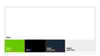
| White | CMYK 0/0/0/0 | RGB 255/255/255 | HEX #FFFFFF | - | - |

| WAGO Green | CMYK 60/0/100/0 | RGB 110/200/0 | HEX #6EC800 | Pantone 369 C Pantone 376 U | RAL D2 120 60 63 |

| Black | CMYK 0/0/0/100 | RGB 0/0/0 | HEX #000000 | Pantone Process Black | RAL D2 000 15 00 |

| WAGO Anthracite | CMYK 85/75/50/60 | RGB 30/40/55 | HEX #1F2837 | Pantone 432 C Pantone 7547 U | RAL D2 240 30 05 |

| WAGO Light Gray | CMYK 0/0/0/11 | RGB 239/240/241 | HEX #EFF0F1 | 7 % Pantone 427 C 7 % Pantone 7547 U | RAL D2 250 85 05 |
Promotional Colour Key
For our promotional touchpoints the primary colours are White and Green. Green and White should be used in relation as seen in the colour key. Anthracite and Light Gray can be used to highlight and seperate informations and sections.
Functional Colour Key
For our functional touchpoints the primary colour is White. It supports a clear communication. Green, Anthracite and Light Gray are the secondary colours. These secondary colours can be used to highlight and separate different topics.
Secondary Colours
WAGO Anthracite 70-15% and Light Gray are used as the accent colours for touchpoints the requiremore colours than the main five above.

It is important to consider readability when selecting colors for backgrounds. Ensuring sufficient contrast between text and background colors enhances accessibility. For detailed information, including a color contrast chart, please visit our accessibility page.