Corporate Design
Our Corporate Font
Typography is more than just letters – it’s expression, attitude, and identity. Our corporate font WAGO Connective is the visual voice of our brand. It speaks with clarity, modernity, and accessibility, forming the foundation for communication that provides orientation and builds trust.
Designed with functionality in mind, it ensures readability and consistency across all applications – from digital interfaces to printed materials. It is the unifying element that structures our content and carries our messages.
But brand communication also thrives on emotion and character. That’s why we complement our core typeface with our serif-accented font Lexia, used where attention and impact are key. It brings depth, personality, and expressiveness into our communication – adding a distinctive tone to our messages.
Together, these two typefaces create a typographic interplay of function and emotion, of structure and style. This is how we shape a visual language that not only informs but inspires – making our brand tangible across every medium.


Promotional Typeface
The typeface Lexia should be used for more promotional layouts, such as posters and magazines. The font should primarily be used in uppercase. There are a few exceptions where mixed spelling is possible. These are, for example, headlines that are too long or quotes that are no longer legible. There are also exceptions within the magazine design layout. For copy texts WAGO Connective light will always be used.
Lexia should not be used in user interface designs, such as on websites or in software application interfaces. Due to its serif characteristics, the typeface is less suitable for digital interfaces where clarity, usability, and quick readability are essential. Lexia is a more expressive and promotional typeface and should therefore be reserved for communication with a stronger brand or editorial character.

Functional Typeface
The typeface WAGO Connective should be used for more functional layouts, such as brochures and product information.
For copy WAGO Connective light will always be used.
Variability of the Lexia
The typeface Lexia can be used in five different font styles. The typography can be adapted to the requirements, context or statement of an application.
Lexia is the primary typeface for promotional headlines. The font-weight (Regular to Bold) can be freely selected to support the message supposed to be delivered.
The font-weight Light should be used for sublines.
Variability of the WAGO Connective
WAGO Connective is a variable font, offering flexible typographic expression across different contexts. In addition to its dynamic capabilities, we provide the Light, Regular, and Bold styles as standalone cuts. Depending on the design requirements, the font weight can be adjusted seamlessly to enhance readability, emphasize content, or align with the visual tone of the medium.
Line Spacing and Tracking
Headlines for both the Lexia XBold typeface and the Aktiv Grotesk typeface are the same line spacing as the pt size of the font (e.g.: 38pt Size = 38pt Leading). Tracking for headlines is always -10.
Spaces between letters contribute to the visual appeal and legibility of text. Some pairs of letters may create too wide or narrow spaces. The bigger the type is, the more visible the spaces are. Therefore it is recommended to condense or expand them especially in headlines.
Typography is ideally ranged to the left when it comes to creating and shaping text content. This provides the eye with a constant and natural starting point making text easier to read.
When setting ranged left typography, it’s important to take the time to balance the ragged edge of the text as effectively as possible. This improves the legibility and neatness of the block of text. Also, use sentence case and never set sentences solely in capitals.
Our typography has a line spacing of 130% for bulk copy and bulk text.
100% of font size = 130% of line spacing
e.g.: 12pt font size = 15pt line spacing
Typeface Hierarchy
Depending on the length of the headline, it can be liquidly scaled between 1.25x and 2x. This rule also defines as well as the size of the Subhead as the spacing between Subhead and further copy.
Header (1.25 – 2x: Lexia XBold (uppercase) or Aktiv Grotesk bold
Subhead (0.5 – 1x): Lexia Light (uppercase) or Aktiv Grotesk regular
Introtext: Aktiv Grotesk, Medium
Body Text: Aktiv Grotesk, Light
Application
The typography can be set in black, white or green. A font variant can be selected depending on the importance of the statement or key message. Line spacing has to be applied as previously described.
Application on Different Backgrounds
Depending on the background, the font colour may vary in order to guarantee the best legibility possible.
Fallback Fonts
If the corporate fonts WAGO Connective and Lexia are not available in a specific application or cannot be used for technical reasons, defined fallback fonts must be applied to ensure a consistent appearance.
If WAGO Connective is unavailable, Arial should be used as the fallback system font.
If Lexia, which is primarily used for headlines, is unavailable, Roboto Slab should be used as the fallback font.

Use of WAGO Connective in Presentations and Emails
WAGO Connective is a custom typeface developed exclusively for WAGO and is only available on internal systems. When used in files shared with external recipients, such as customers or business partners, it is automatically replaced by a system font. This can result in inconsistent rendering in PowerPoint presentations and emails. We therefore recommend the following use:
WAGO Connective
- Marketing materials (print, PDFs, websites, software, etc.)
- Official printed documents and business letters
- Estimates, bills, order confirmations, and delivery notes
- Product labeling and packaging
- Printed postings
- Building signage and markings
Arial
- Digital office documents (Word, Excel, PowerPoint)
- External presentations
- External emails

Accessibility and Typography
Due to contrast issues for readability, please ensure that green headlines are used with a font size of at least 20 pt (for printed media) / 80 px (for digital media) when placed on a white background. Similarly, ensure that white text on a green background maintains the same font size for optimal readability. This rule applies to print media. For more information, please visit our accessibility page.
Dont's
Always use capital letters for Lexia Headlines.
We do not use upper and lower case letters in our headlines and sublines in Lexia.

Use a font color with sufficient contrast for your background.
To ensure accessibility in the digital sector, WAGO green can no longer be used on light backgrounds, such as white, light gray or our light anthracite tones, in all font sizes, as the contrast is too low for legibility. Similarly, white text should not be used on a green background in the digital sector for the same reason. In the print sector, we are more flexible and green color can be used for headlines from a font size of 20 pt.

Do not use a text color that is hard to read.
Always make sure that there is enough contrast.

Do not use the same size for each level of the hierarchy.
Do not use the same weight for each level of the hierarchy.
Always align the hierarchy levels to the left – do not stagger different levels.
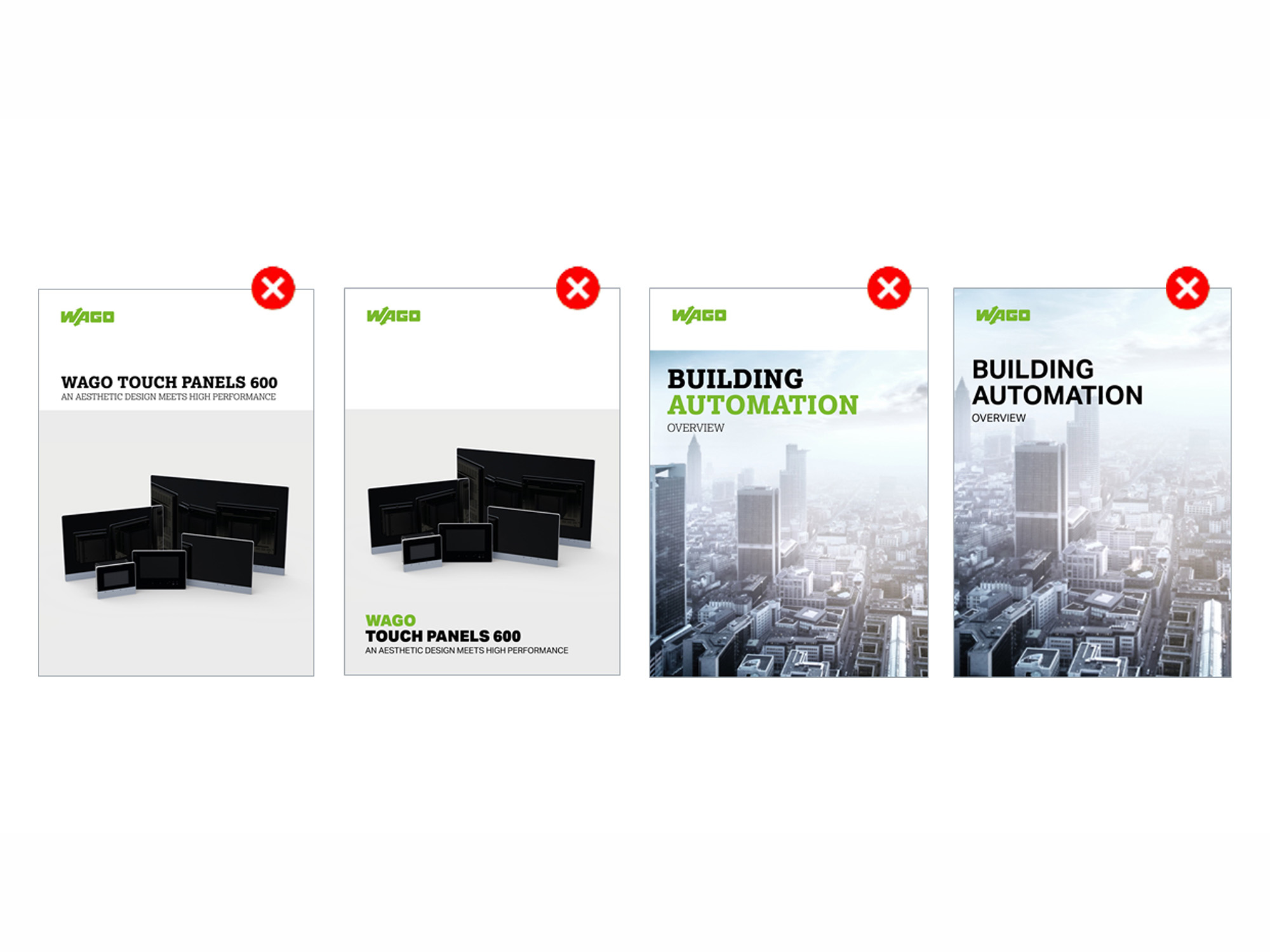
Don'ts
The variable font only applies to our distribution media, such as advertisements, magazines or social media ads.
It should not be applied within our classic media, such as our product brochures, catalogues, or product data sheets.
Asian Typefaces
Use of Asian Typefaces
To ensure visual consistency and optimal readability across all regions, our Corporate Design now includes dedicated typefaces for Asian languages. For content in Simplified Chinese, Japanese and Korean, please use the respective Noto Sans font packages provided.
These fonts are available in multiple weights and styles to support a wide range of design applications while maintaining alignment with our global brand identity.
The thin font style is generally used for body text, while bold is used for headilines.
Refer to the font packages when creating materials in these languages.
Lexia: Use in Different Languages
| Character System | Font | Font Styles | Download | Fallback Font | Font Styles | Download |
| Alphabet-Based Languages | Lexia | Light and Extra Bold | Adobe Creative Cloud or www.daltonmaag.com/library/lexia | |||
| Cyrillic | Roboto Slab | Light and Extra-Bold | https://fonts.google.com/download?family=Roboto%20Slab | |||
| Chinese Simplified (China) | Noto Sans SC | Light and Black | https://fonts.google.com/download?family=Noto%20Sans%20SC | |||
| Chinese Traditional (Taiwan) | Noto Sans TC | Light and Black | https://fonts.google.com/download?family=Noto%20Sans%20TC | |||
| Japanese | Noto Sans JP | Light and Black | https://fonts.google.com/download?family=Noto%20Sans%20JP | |||
| Korean | Noto Sans KR | Light and Black | https://fonts.google.com/download?family=Noto%20Sans%20KR |
WAGO Connective: Use in Different Languages
| Character System | Font | Font Styles | Download | Fallback Font | Font Styles | Download |
| Alphabet-Based Languages | WAGO Connective | Light, Regular and Bold Variable | Arial | Regular, Medium and Bold | ||
| Cyrillic | WAGO Connective | Light, Regular and Bold Variable | Arial | Regular, Medium and Bold | ||
| Greek | WAGO Connective | Light, Regular and Bold Variable | Installed by the IT department or upon request via the design team (design-marketing@wago.com) | Arial | Regular, Medium and Bold | |
| Chinese Simplified (China) | WAGO Connective SC | Light, Regular and Bold | Installed by the IT department or upon request via the design team (design-marketing@wago.com) | Arial | Regular, Medium and Bold | |
| Chinese Traditional (Taiwan) | WAGO Connective TC | Light, Regular and Bold | Installed by the IT department or upon request via the design team (design-marketing@wago.com) | Arial | Regular, Medium and Bold | |
| Japanese | WAGO Connective JP | Light, Regular and Bold | Installed by the IT department or upon request via the design team (design-marketing@wago.com) | Arial | Regular, Medium and Bold | |
| Korean | WAGO Connective KR | Light, Regular and Bold | Installed by the IT department or upon request via the design team (design-marketing@wago.com) | Arial | Regular, Medium and Bold |
Download Section
Font suppliers
Lexia is an Adobe font. If you work with the Adobe Suite, you can download it here for free:
https://fonts.adobe.com/fonts/lexia
If you do not work with the Adobe Suite, you can buy the typeface here: Lexia: https://www.daltonmaag.com/library/lexia
WAGO Connective is WAGO’s proprietary corporate typeface.
It is pre-installed on WAGO devices and not available through Adobe or public font libraries.
If you need access to the font, please contact the design team at: design-marketing@wago.com
FAQ
Yes, the font supports Latin, Greek, Cyrillic, and Asian writing systems including Chinese, Japanese, and Korean. For Asian languages, we use Noto Sans, which is provided in packages that include WAGO Connective symbols to ensure visual consistency.
The font is distributed centrally by IT. If you are working externally or in a regional office, please contact design-marketing@wago.com to request access or installation support.
The font is licensed for internal and external use within WAGO-related projects. For third-party use (e.g., agencies or vendors), please consult the design team to ensure proper licensing.
Your contact person at WAGO